CHATTER CLOUD // BRANDING + UX DESIGN
Chatter Cloud is an emerging social media scheduling tool. They needed branding and site design that would appeal to modern content marketers with a focus on intuitive user experience. view full prototype here
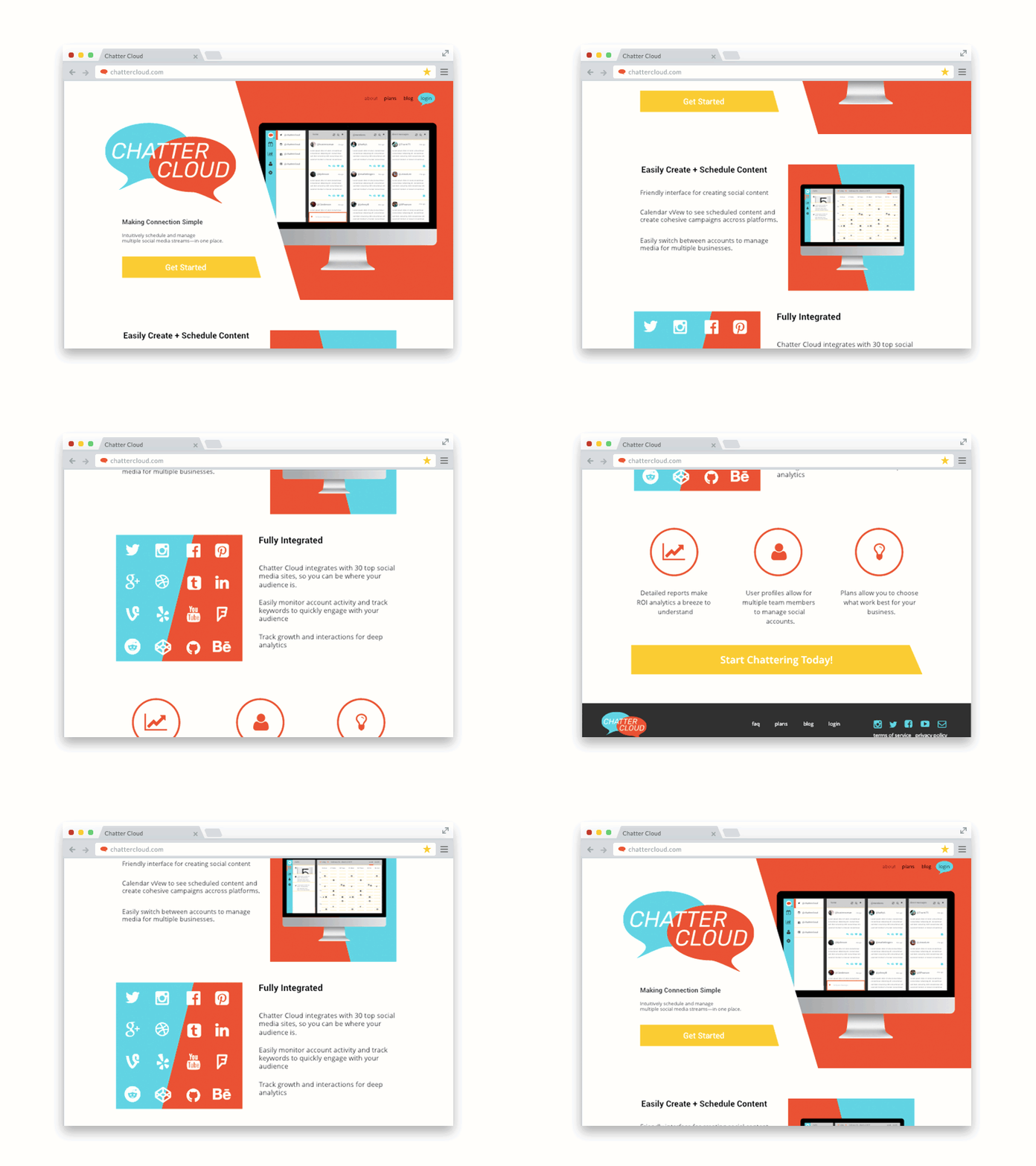
The resulting application design uses a sidebar navigation, with colors and iconography to facilitate use. The website design is simple, featuring multiple CTA's and clear page layouts, so that users are funneled through information towards the registration area.
01.
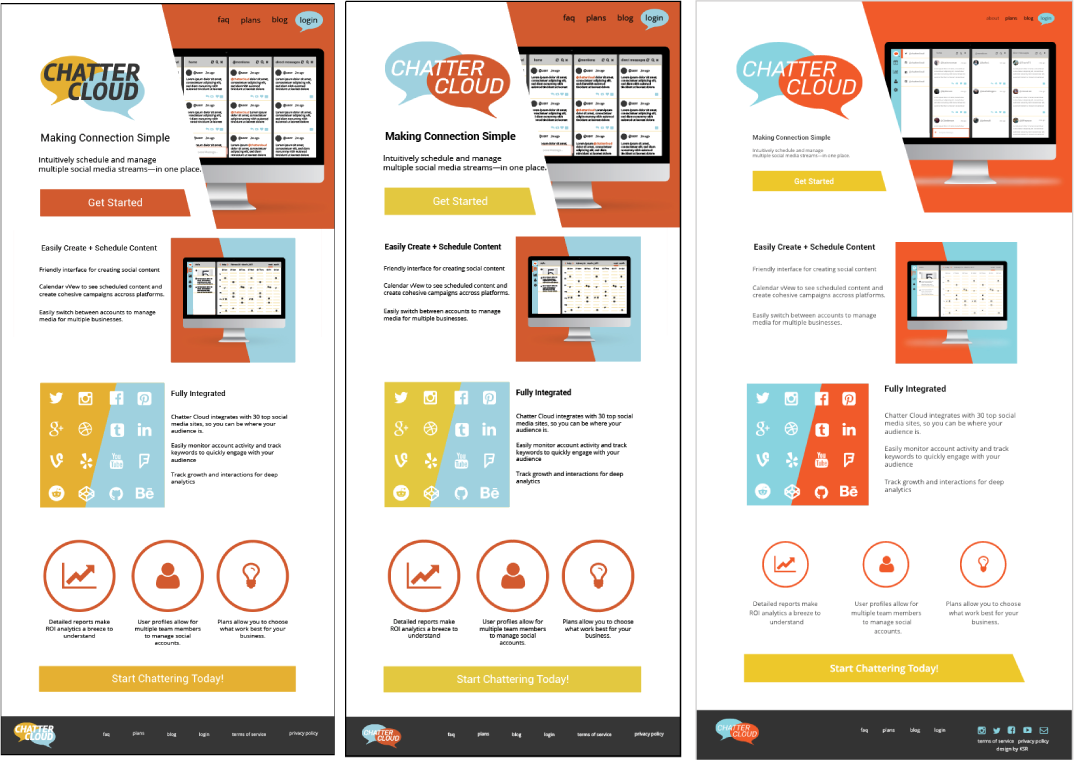
My hand-drawn wireframe allowed me to determine the hierarchy of the homepage. The top “splash” page sets the mood of the website, introduces the product, and features a clear CTA. The rest of the page showcases unique features of the app and invites clients to learn more.
02.
Colors were chosen as a variation on a primary color scheme. This implies that Chatter Cloud is approachable and familiar. Instead of using red in the color scheme, orange is cheerful, playful, and bold—without aggression.
03.
Through mockups, I continued to tweak the logo for approachability and brightness. The overall layout uses angles and color to draw the viewers eye down the page. Navigation is simple and clear CTA’s are present at the top and bottom of the page.


